User Experience Research & Redesign Prototype
Reimagining the MUNI Kiosk
Simplify it for everyone.

So, what was wrong with the MUNI kiosk?
Outdated hardwares causing confusions and obstacles.
Physical Button UI
Doesn’t align with the digital screen, causing confusion.
Lack of accessibility to users with mobility issues, due to physical button as the only input.
Visual Centric Interface
Activating audio interface with physical button can be improved more intuitively for the users with vision impairments.
Failing in Information Delivery
The digital screen was too pixelated to provide proper readability of the texts.
Typography lacked of information hierarchy and readability.
The information as mostly displayed through text, and lacked visual indications.
Inconsiderate Hardware
Original kiosks had two height options, but the angle with the eye level caused misalignment.
Dispenser was only at the bottom, making it harder to reach for users with mobility issues.

How might we:
Make MUNI kiosk’s experience more easier and accessible for the broader users?
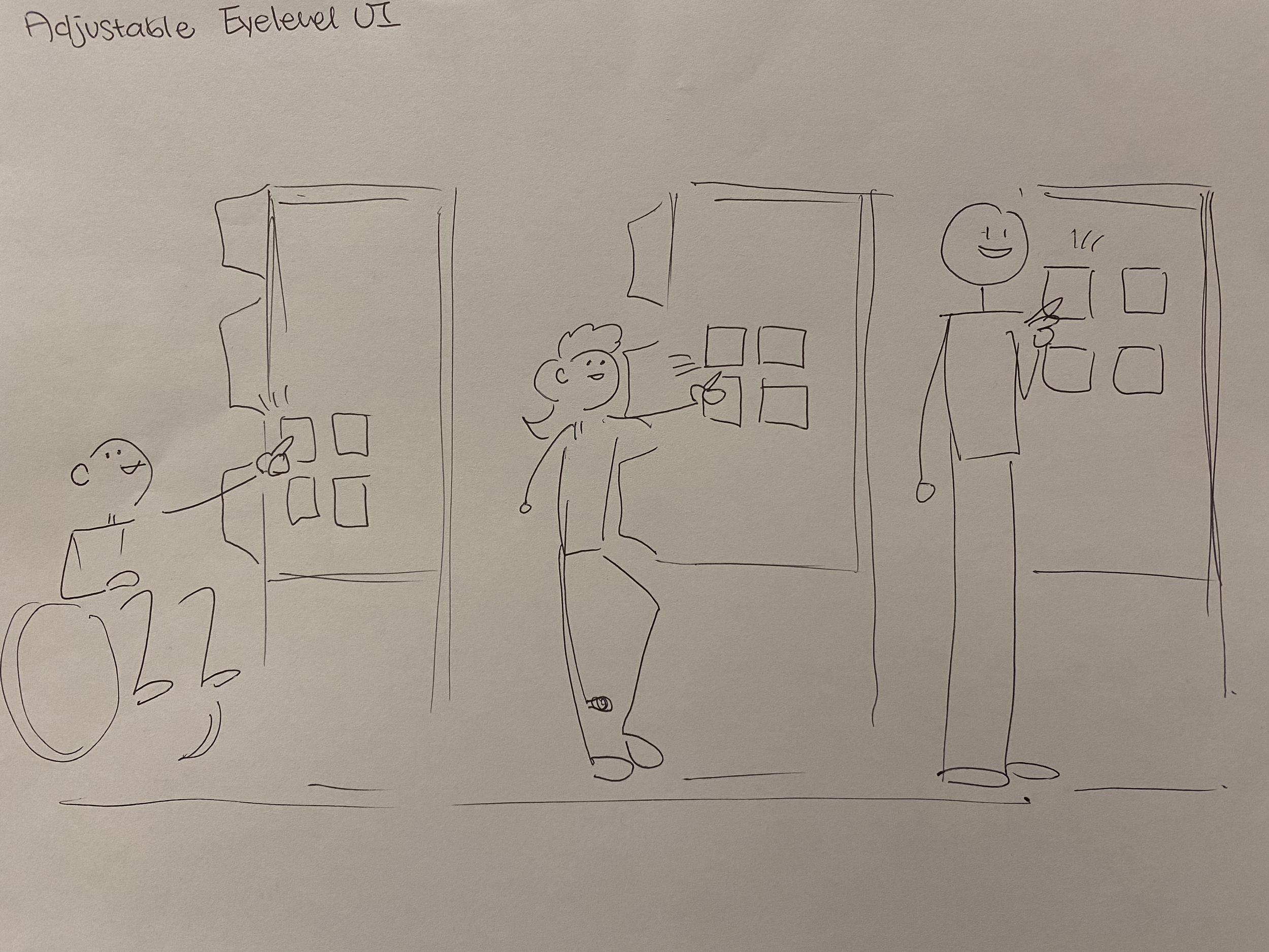
The kiosk ADJUSTS to you.
I dived deeper into the accessibility of a kiosk hardware, and based on the research, I came up with the adjusting UI based on the users’ eye level.
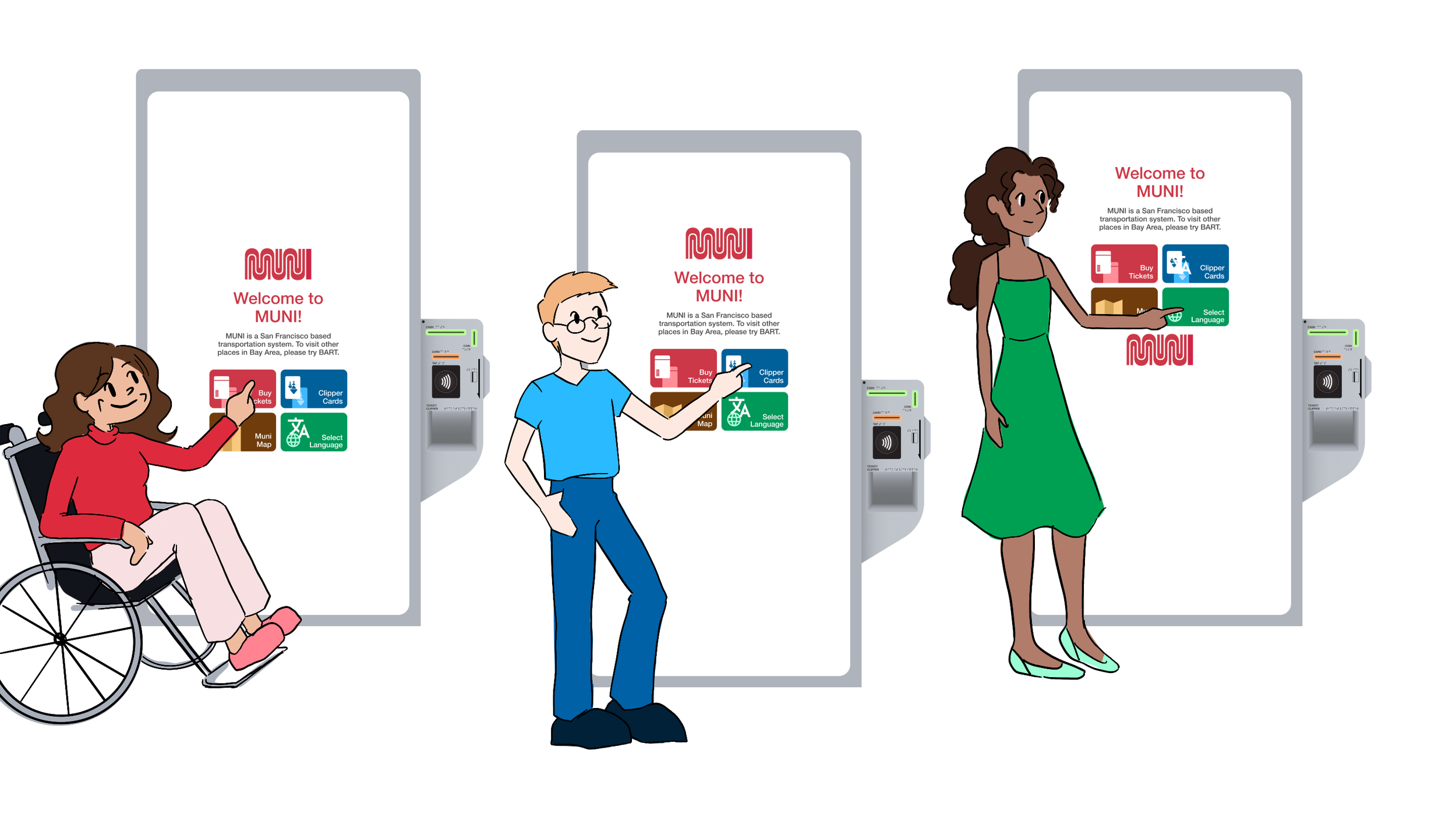
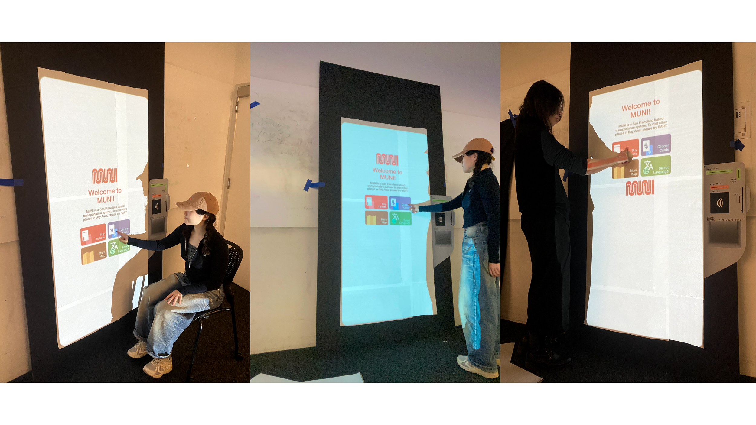
Three levels of UI floats around the tall screen based on the user’s eye level detected by the camera.
While the interactive area remains around the arm level, text for indications is placed directly on the eye level, making it easier for reading and interaction.
The interactive area remains 30 inches, with maximum height aligning with the shoulder height and the minimum height aligning with the elbow height.
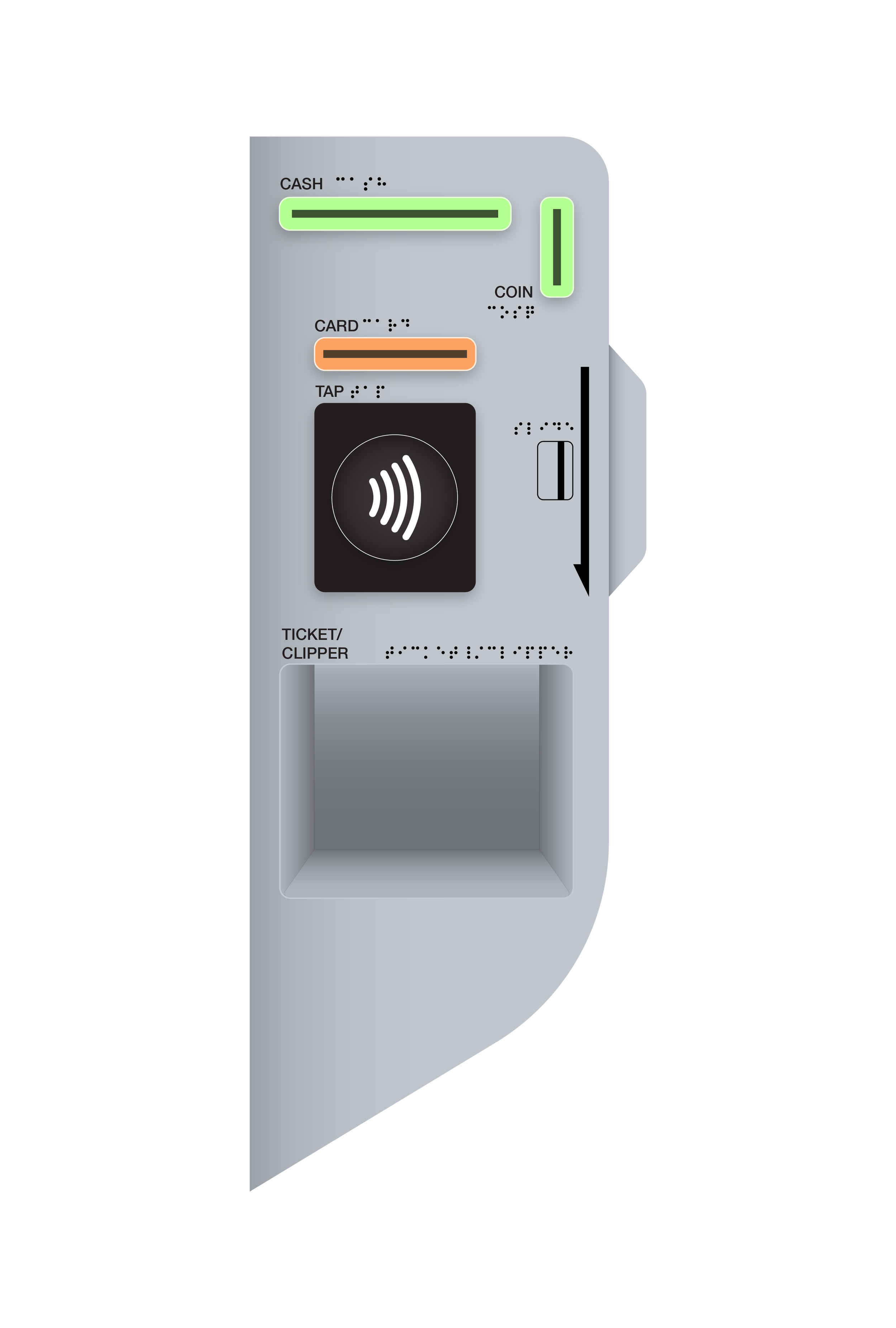
The physical hardware for payment and dispensing remains in the middle, where everybody can reach it, just like a doorknob.
image source / ADA Standards for Accessible Design
The kiosk SPEAKS & LISTENS to you.
Audio interface can be more than an option. Instead of turning it on through a physical button, the kiosk will automatically start to speak when the user approaches.
The camera will detect a user approaching to a certain distance and start the audio interface, reducing unnecessary step to turn it on.
Users with severe visual impairments can find touch screens equally challenging, therefore the interaction can happen solely based on audio input, speaking!
The kiosk is FRIENDLY to everyone.
Public transportation is for everyone, and should feel easy and friendly to use to everyone. Inviting call to actions along with icons make it possible.
Inviting and easy-to-follow call-to-actions creates friendly environment to beginners, visitors and all users overall.
Icon-based UI enables users to understand the steps and selections much easier compare to text-only UI.
Visual indications as the primary call-to-actions help users to understand the actions required, making the experience easier.


The Process
Personas & Storyboarding

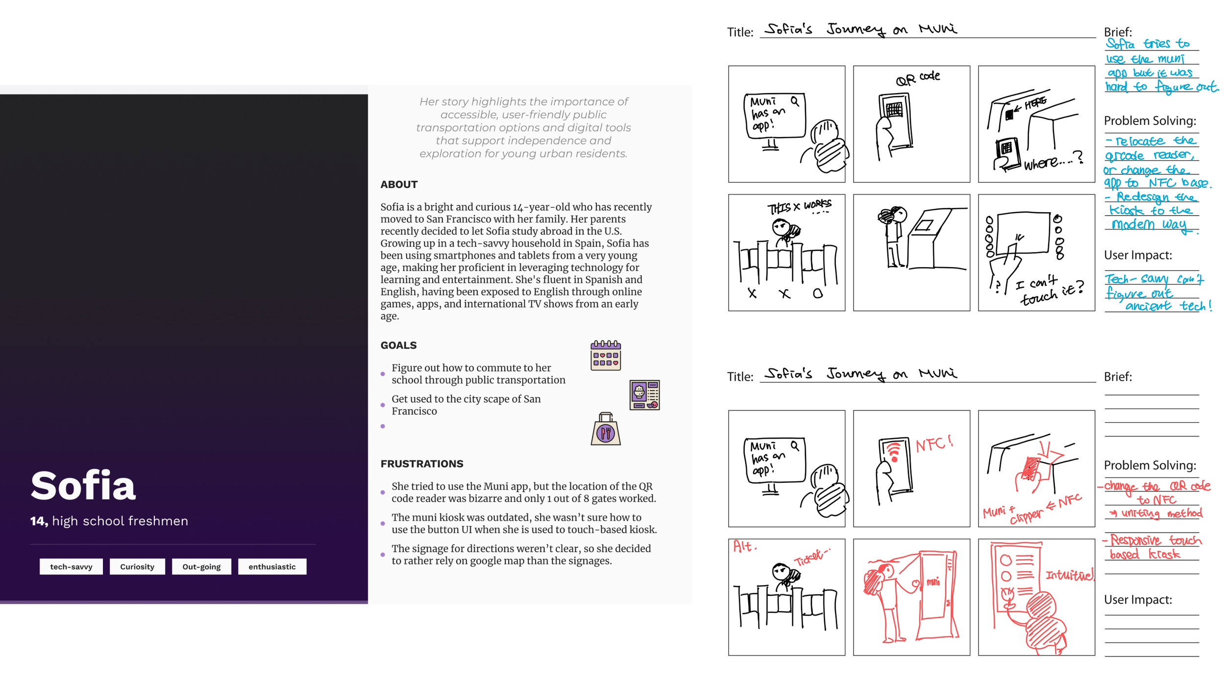

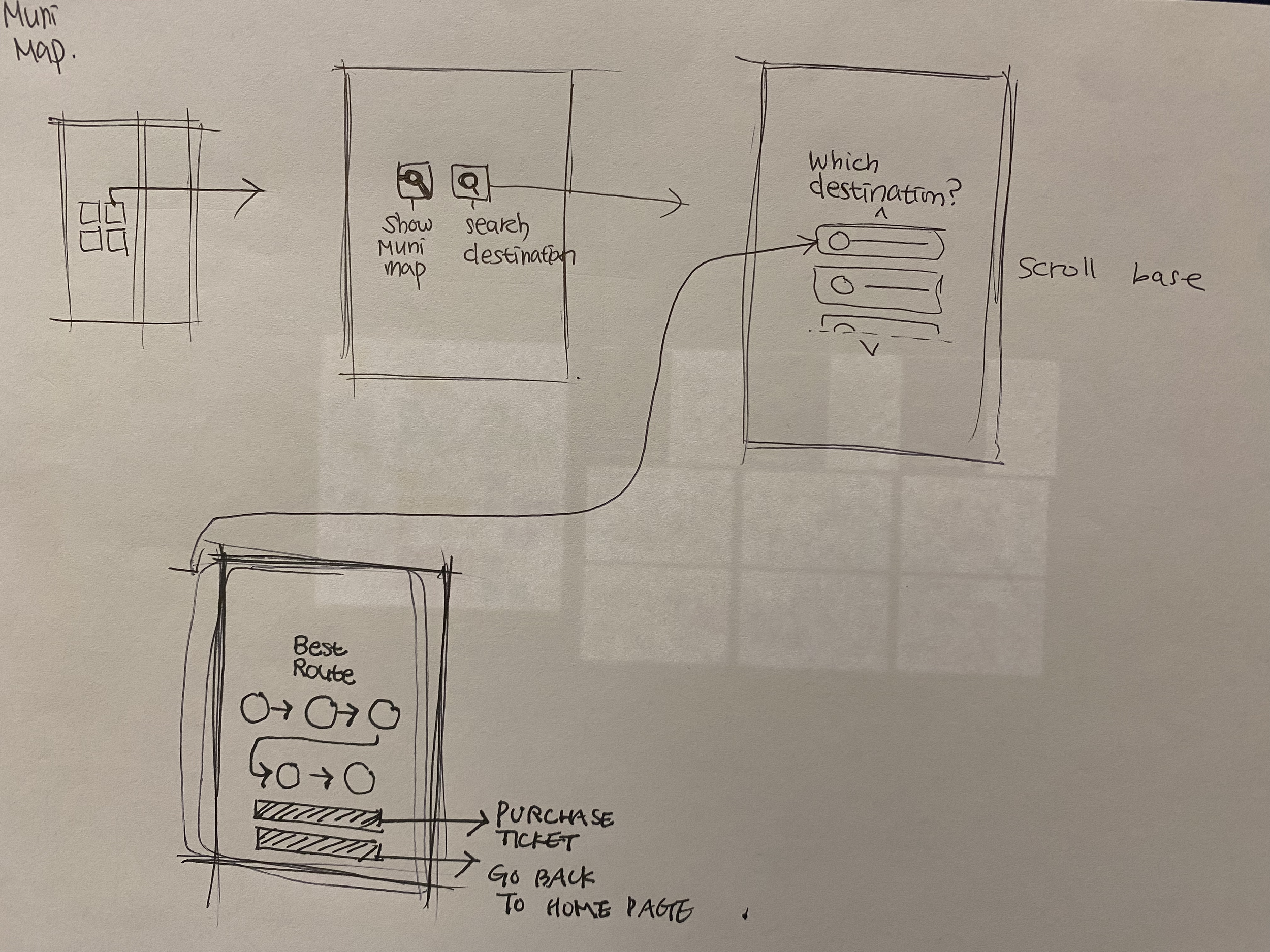
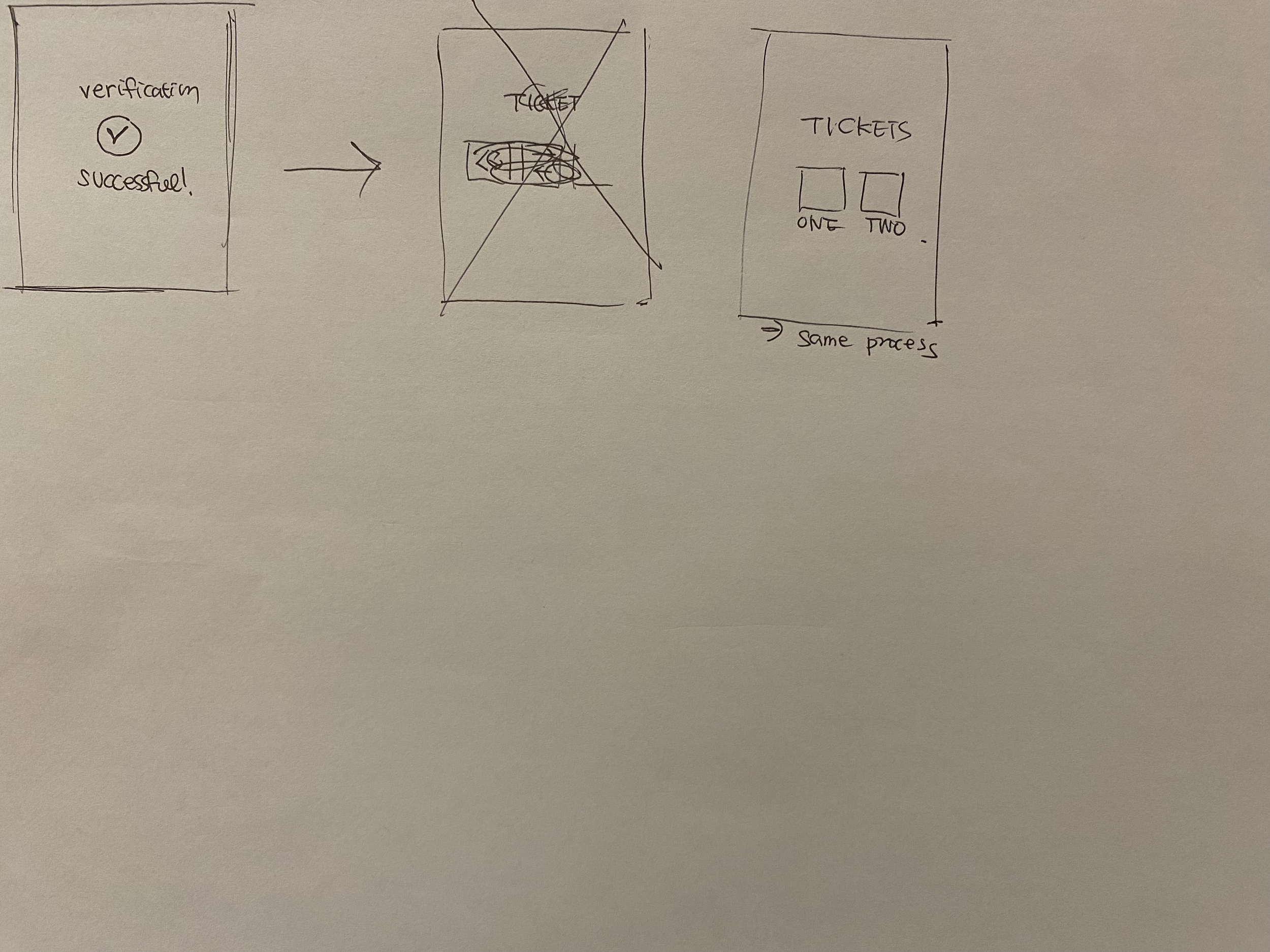
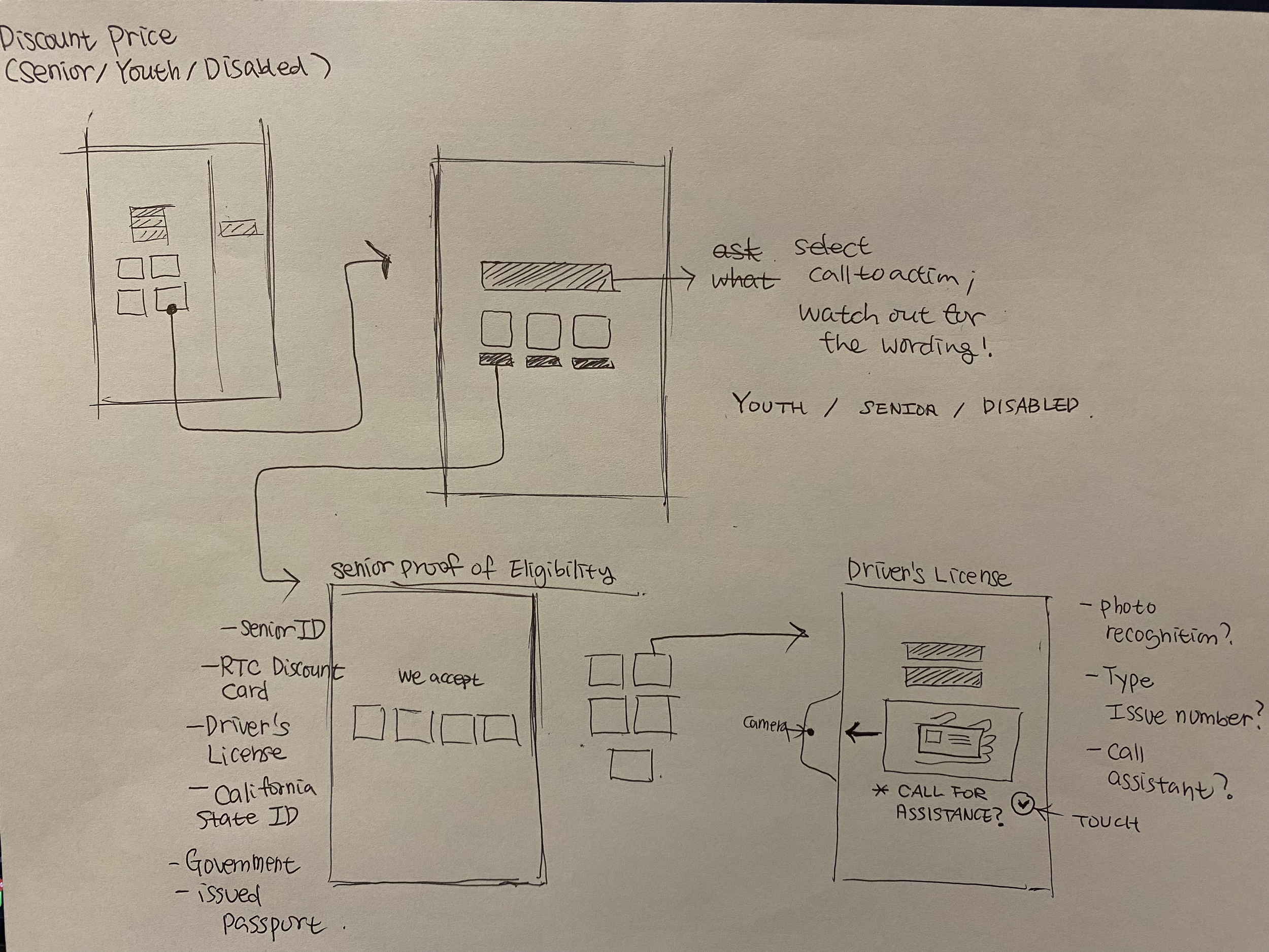
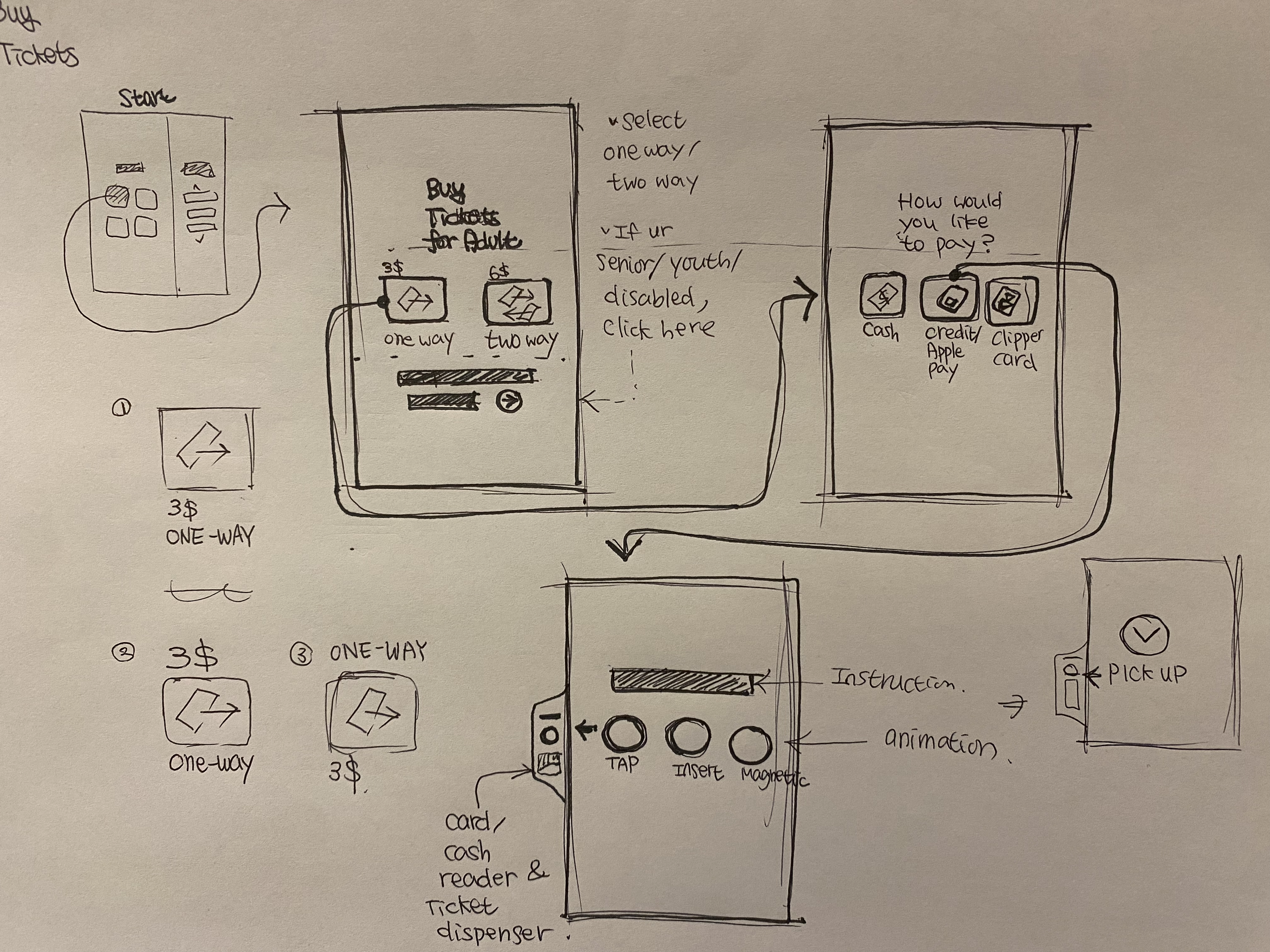
User Flow Sketches
